Reflection on the Wave Report
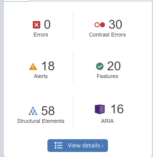
In my WAVE report, I found that while there were no major errors except contrast errors. The contrast errors were unexpected, and emphasize the need to choose high-contrast colors for my text and background. These findings highlight areas where I can improve accessibility in future designs, especially the importance of color contrast and being mindful of structural elements.
Exploring Text-to-Speech Tools
I have used Text-to-Speech tools before, but I experimented with different voices in this module. I found that certain voices, especially those with a steady pace and clear tone, made information easier to absorb.
The tool seems extremely useful for making content accessible and allowing users to multitask. This experience reinforced the importance of providing audio options.

Creating an Infographic on Air Pollution
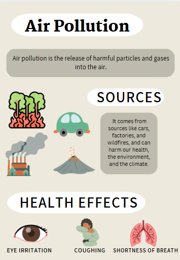
For this module, I used Canva to create infographic on Air Pollution.
Design principles I used:
- Contrast: contrast between text and background colors to enhance readability.
- Hierarchy: Using bold headings like “Sources” and “Health Effects” helped guide viewers through each section logically.
- Icons and Visuals: I used icons to represent different sources of pollution and health effects, making the content more visually engaging and easier to understand.
What Inclusive Design Means to Me
Inclusive design means creating content that considers all users, particularly those with more challenges. It’s about ensuring that everyone has an equal opportunity to access and engage with the material. To me, inclusive design is an approach that values each learner’s experience and abilities.
Ensuring Accessibility for Learners with Visual Impairments
To make infographics accessible for those with visual impairments, I would add the following:
- Detailed Alt Text: Include descriptive alt text for all icons and visuals, explaining the content and context of the infographic.
- Transcript Option: Provide a written transcript or text description of the infographic, outlining each section’s content so that screen readers can convey the information.
- High-Contrast Colors: Adjust colors to high contrast, making text legible for users with low vision or color blindness.
Leave a Reply
You must be logged in to post a comment.